Thursday, December 7, 2017

Opera

https://hicksdesign.co.uk/work/opera-desktop-browser

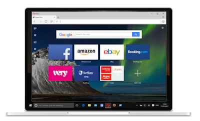
The design above was created by Jon Hicks, another well-known, successful graphic designer.
As an aspiring web developer, I automatically was drawn to to this design for opera web-browser. It has a super easily accessible layout and very balanced through the center. The only thing I would change about this design is that I take the icons on the left and bump them down so there align with the google search bar, and I'd do the same with the single icon on the right as well.
The dimmed background is vital in the design because then it doesn't take away from the apps/sites featured on the screen.
Wednesday, December 6, 2017

Moondate

pinterest.com

Above is a wordmark for a clothing store, Moondate, that I found on pinterest. Although the two o's are in different positions, they remain asymmetrically balanced to one another because they're equally sized and put weight on both top and bottom. I really enjoy the gold foil they use to really make thew wordmark shine and stand out. 

The Jungle Book

.
http://www.tanamachistudio.com/

Obviously, this is a book cover for the Jungle Book, but it was created by Dana Tanamachi. I was really drawn to this because one, I am not the best at book covers since I don't read much and two, its great use of detail while following design principles. 
The first design principle I want to point out is how she uses great detail in this design, but it is balanced. By symmetrically balancing this design, it looks great! All of the detail on the left matches the right. 
The second design principle I want to point out is how all of the detail creates emphasis on the title. It is almost like all the animals are pointing to the title of the book by just surrounding it. 
The last design principle I want to discuss is the way it uses color. The earthy flat green background provides great contrast against the metallic gold of the detail and type; it really pulls the view in. 

Wine Campaign

.https://alextrochut.com/


The wine campaign featured above was designed by Alex Trochut, a pretty well-known designer. I found this wine packaging design very appealing because of the eye catching colors even though grey and black are two of them. I think what makes the colors so eye catching, is there metallic shine. The metallic shine also contributes to adding depth in the splatters/droplets on most or the package.
This packaging is also appealing because of the random balance it uses to make the splatters/droplets seem even more real. This design also successfully pulls off using 2 different types of balance in this design because the type is almost completely symmetrically balanced through the center over the splatters/droplets.

Sunday, November 19, 2017

Pinterest logo


pinterest.com

Above is a logo I found very inspiring on pinterest. I found it really inspiring and interesting because of the way they keep the logo unified even though there is a quite a bit of space between the A and the B. I haven't done any research on what this logo is for since I found it thumbing through pinterest logos. 
I also found the color palette on the design very pleasing too because of the amount of contrast between the black of the letters and the neutral beige color of the background. I find it to be the perfect amount of contrast to pull the viewer right to the logo. 

Wednesday, October 25, 2017

Land Heritage

design from logodesignlove.com

Above is a very clever design that is a logo for Land Heritage, which is not really around anymore. A farmer had founded the company who had realized there was a surprising disconnect among people between land and food production. 
My interest was taken by this design because it is very minimalist and very clever how the form of the heart is repeated, decreasing in size each time; finally forming the head of a grain plant. Even though the grain head is curved like it is blowing in the wind, the design remains very symmetrically balanced. 
The only down fall of this logo is that is doesn't directly tie into the message the owner of Land Heritage wants people to recognize, it still gives you a sense that food is tied in with the life of humans. The logo does catch interest though, and it could make people curious to know what it stands for if it was still used today. 

Wednesday, October 11, 2017

Cravings

Print magazine- The Innovation Issue

The design above is part of a website that was designed for findyourcravings.com which focuses on "food, wine, travel, and lifestyle." I really liked this design because of the way if all lines up in the center and also remains very clean/minimalist. The decorative type looks like it was hand-wrote, which hand-written types are my favorite so I really how it was used in this design. Immediately, the word choice of "cravings" draws me in to want to find out more. I can definitely find myself checking out the website sometime here soon.