Wednesday, October 11, 2017

Balance

Print magazine- The Innovation Issue

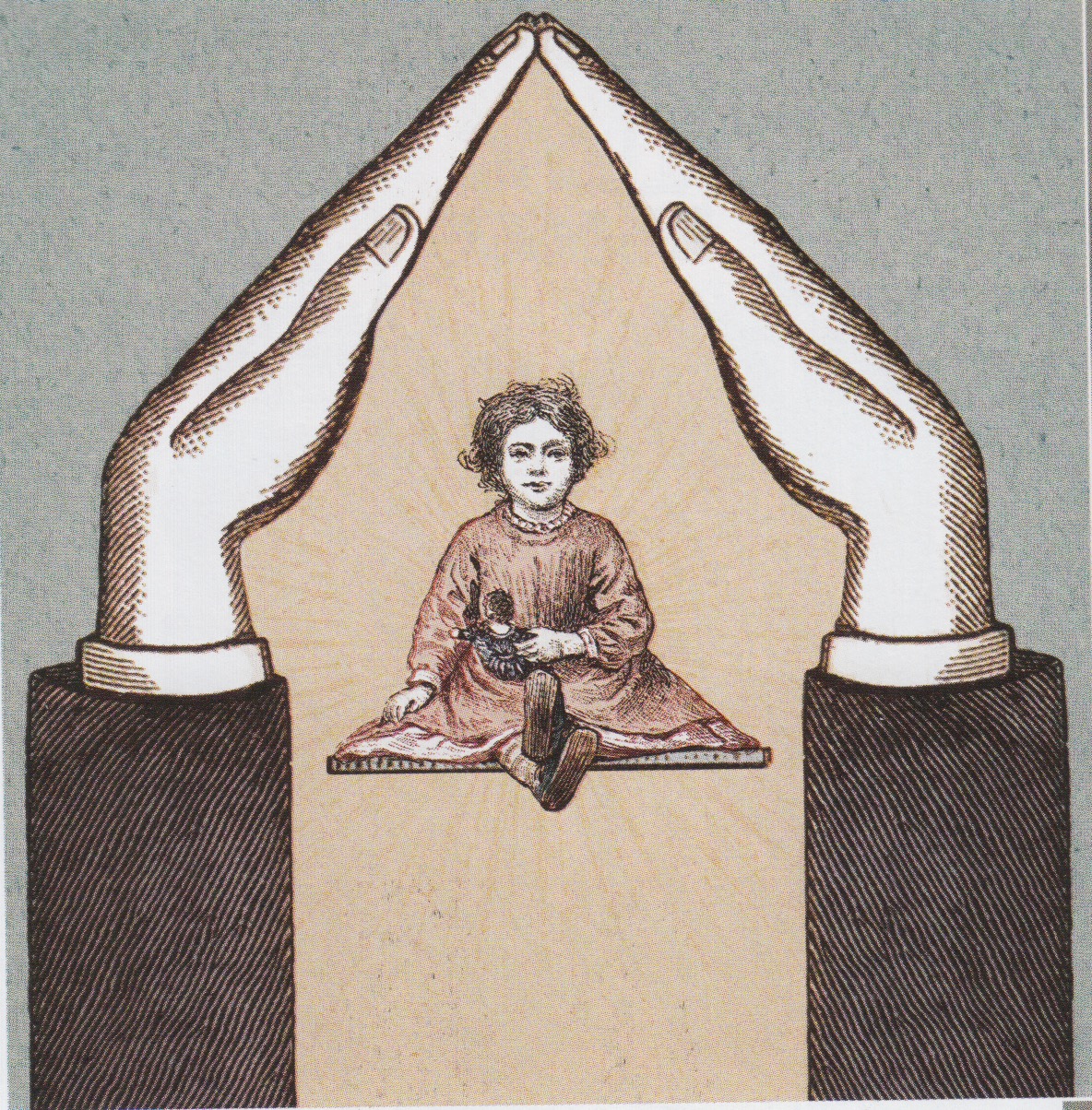
The design I have chose for this weeks blog is an Illustration featured in Print magazine that  was originally from To the End of June in The New York Times Sunday book review about foster care. The balance of this symmetrical illustration really grabbed my attention because it almost completely matches each side. If you were to bend this in half vertically, it would almost completely match up. I find this very ironic in a way because the illustration is very balanced yet the topic is was designed for doesn't have much balance in my opinion. When I think of a foster child, I image them not having a very balanced life because they are sometimes moved around a lot to different homes. 

Stocksy

\
Print Magazine- The Innovation Issue

Above is an advertisement I found in Print of course, for a stock image site. I really liked the ad because of the photography and the way they used their type in the word mark. The photography is playful in a way because of the content of the photo, but I also like that there isn't too much going on in the photo. The photo is pretty symmetrically balanced, bringing your eyes straight to the word mark. I really like the playful type of the word mark, its gives a care-free feeling with the extended "swoosh" in the T, K and Y. Although everything is not perfectly symmetrical in the way things are lined up, it imperfectly appears that way.

Wednesday, October 4, 2017

Deconstructivism

This design was a Regional Winner of New York for Print mag in 2016 for Atlantic Theater Company. I really liked this design because it looks similar to designs in the Deconstructivism period. The way the rectangular shapes piece together the blue almost silhouetted bird is a characteristic of the deconstructivist style. The rectangles also create emphasis by the position in the design, which creates direction in the design. Although it isn't my favorite color palette, the orange and blue are bright enough to grab one's attention.

Boneshaker

The design I choose for my blog is a great design from Print mag of course. I really liked this wine bottle design because it has a very unique sugar skull with great decorative detail. This design remains really simple and clean, but yet it has so much detail.
When I see wine bottles in the store, they seem rather plain and some look like they were meant to be from later days. This design steps out of the "normal" wine bottle design in a great way.

Tuesday, September 19, 2017

Shortbread Cookies

The design I chose for this week's blog is also from Print magazine, except I scanned my image in this time rather than pulling it from the website.
This design really caught me eye because I am a huge fan the way they did the stickers. The stickers kind of stand out to me as Victorian style because of all the decorative elements that border the fancy type. Also, the colors are very attention grabbing as well.
Although the stickers are all different in their own way, there is unity between them because they are all laid out the same way. Also, the decorative type is emphasized by the decorative boarders.
Now obviously, the stickers are not the only part of this identity for Shortbread cookies. In my opinion, I think the stickers definitely make the design because they are fun and they grab your attention. To add to that, the viewer or consumer is going to be more drawn to the sticker because they want to know what flavor they're buying.

Thursday, September 14, 2017

CBC Pale Ale

Above is a design from Print magazine again that is another regional winner except from the South. I really liked this design for several reasons. The first reason I want to point out is the color pallet. The color palette really grabbed my attention with the bright yellow and sharp indigo. Although, in the particular photo, the bottle seems to not match the packaging. That could be because of the lighting or a printing error.
In addition to the color palette, I really enjoy the overall layout. On the bottle, it has a very symmetrical layout; everything is aligned through the center. That creates a very nice balance and it makes it very easy to read as well. On the packaging itself, it is a bit more scattered and not so symmetrical. It still remains very balanced though and everything lines up in some way. 
Overall this is a great design and very eye catching.


Wednesday, August 30, 2017

Chapman's

Above is design is for Chapman's Beer, that was featured in the Regional Design Awards for the Midwest in Print Magazine. This design really caught my eye due to the vibrant colors. Although the design is not completely symmetrical due to the diagonal color split, the design still feels balanced because the way it still lines up and keeps the same color pallette. It is easy to recognize that these cans are all part of the same brand because of all of their alike features. If you look closely at the cans, it can be noticed that there is a unique design for each flavor. It isn't a detail that throws off the design because it is a very subtle difference. 


http://www.printmag.com/regional-design-awards-2016-winner-galleries/regional-design-awards-winners-2016-midwest/